10 Stimulating Nursing Home Activities for Dementia
Dementia is a debilitating disease that affects the lives of millions all over the world. People with dementia struggle with memory and critical thinking skills, making it hard to perform everyday tasks. While there is no cure, there are steps you can take to help prevent and slow down the progression of dementia.
According to Time Magazine, brain stimulating activities have been proven to help diminish symptoms caused by dementia, such as forgetfulness. Intellectual activities such as putting together a puzzle or painting a picture can stimulate parts of the brain that normally may be neglected.
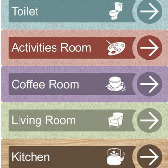
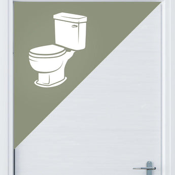
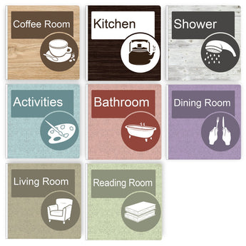
For years care homes have been looking to provide signage that helps their residents, especially those with dementia. So have been opting for the “High Vis” options that seem to be the only thing that meets their requirements on the market. The problem is, it doesn’t look good! So when it comes the carefully considered and designed interior of a home, many care homes have been forced to ruin the ambience with the
signage available to them.

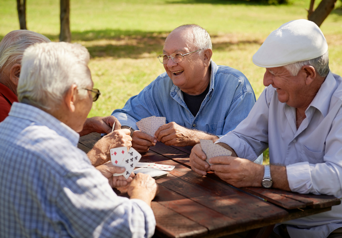
1. Engage in conversation
Something as simple as having a conversation with a dementia patient can help them recall memories from their past. To help them engage, you should always make sure to look at them directly and use a loving tone. Don’t wait for the person with dementia to start the conversation, always lead the conversation and ask questions that will be easy for them to answer.

2. Play a musical instrument
A study published in the Journal of Neuroscience has shown that teaching a person with dementia to play a musical instrument alters brain waves in a way that can help improve their listening and hearing skills. When this occurs, the brain is essentially rewiring itself and healing itself from past traumas.

3. Sing & dance to music from their era
Singing & dancing to music from their era can help bring back
emotions & memories for a person with dementia. Musical aptitude is one of the last remaining cognitive abilities in a person with dementia and it can be used to connect with the person still inside.

4. Read a book
The ability to read can vary depending on different stages of dementia. If the dementia patient can still read, it can be beneficial to set aside each day to do so. Otherwise, reading them a book or even keeping books on their night stand can help stimulate their minds.

5. Look at old photost
Looking at old photos is one of the best ways to stimulate memory and brain activity in dementia patients. Often, dementia patients have lost a sense of themselves as a result of losing their memory. It can be
beneficial to use visual aids from their lives to help them regain some personal identity.

6. Garden
Gardening with a person with dementia can be a good way to increase their physical activity and allow them to have some fun. Getting a group together to work on a gardening project can also allow them to form a sense of community and a common purpose.

7. Cook or bake
Cooking or baking with a person with dementia has a wide range of benefits. It helps engage multiple senses at once, increases their appetite and awakens memories from their past. Sometimes dementia patients lose interest in activities they used to enjoy, such as cooking. Encouraging them to continue to participate in these activities can help improve their cognitive abilities.
8. Deck of cards
Playing with a deck of cards can help stimulate intellectual abilities
in dementia patients. Try giving them a deck of cards and asking them to sort them by colour, numbers or suits. This activity is hands-on and can improve alertness in a dementia patient

9. Doll therapy
Doll therapy is a commonly used resource for dementia patients. By introducing a doll to the patient, you can add a sense of purpose and responsibility to their lives that they have been lacking. It can also be a way of bringing back memories of their children, grandchildren or
younger siblings.
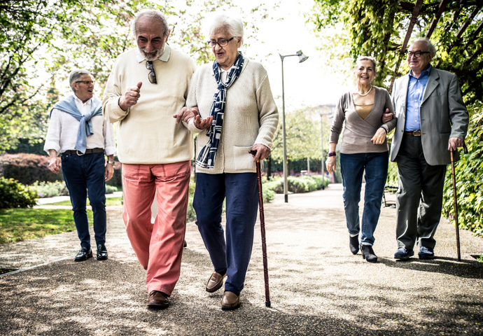
10. Go on walks
Going on walks with a dementia patient is a simple way to get them out in the fresh air and engaging in physical activity. People with dementia sometimes start to walk and wander more so this can be a good, safe way to help them to do so.
Resources:
1. https://www.alzheimers.net/2014-03-06/stimulating-activities-for-alzheimers-patients/
2. https://www.nhs.uk/conditions/dementia/activities/
Shop The Range
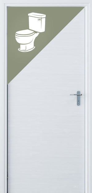
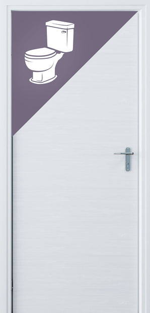
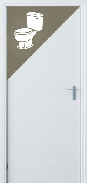
1A Accredited by the University of Stirling's Dementia Services Development Centre.Our signs make living with dementia that bit easier. The range is high contrasting, texturised and with custom designed iconography to make them prominent and recognisable without compromising on aesthetics.


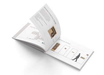
Signage Consulation
Send us your drawings, we'll do the rest. No limit on the size of your floor plans. We will design a full wayfinding schedule to solve all your problems and create a dementia friendly environment that looks great.
Turnaround Time: 3 business days from when you submit your drawings.
What You Get: A full wayfinding schedule in PDF format to best suit your floor plans
We do not offer refunds on our consultation service. However, if you decide to purchase our signage - the €99 will be automatically credited to your account.

Commercial Enquiries
If you aren't sure what you need we can help with that too. We offer a full consulting service to develop a wayfinding scheme for your building.