Dementia Friendly Colours
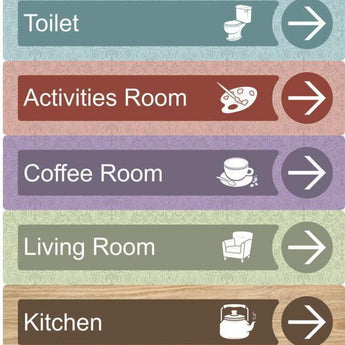
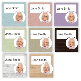
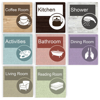
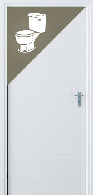
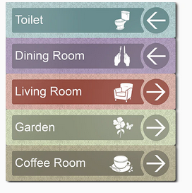
The elderly and in particular people living with dementia typically experience reduced sensitivity to contrast coupled with reduced peripheral vision, depth perception, and visual acuity. To counter this, we have created a range of colours and finishes that ensures our signage grabs attention . Our dementia friendly signage range is the only in the world to be accredited by the Dementia Services Centre of the University of Stirling.
Shop The Range
1A Accredited by the University of Stirling's Dementia Services Development Centre.Our signs make living with dementia that bit easier. The range is high contrasting, texturised and with custom designed iconography to make them prominent and recognisable without compromising on aesthetics.


