Dementia-Friendly Signage Resources
Expert guides, best practices, and room-by-room advice to help you create supportive, well-signed care environments.
106+ expert articles across 7 topics
Featured Articles
Browse by Topic
All 106 articles
Select a topic to filter
How to Sign Your Care Home

How to Sign Bedrooms in a Care Home
A comprehensive guide to choosing and installing bedroom signage that supports orientation, independence, and dignity for residents living with dementia.

How to Sign Bathrooms & Toilets in a Care Home
Practical guidance on bathroom and toilet signage that reduces continence-related incidents and supports dignity for residents living with dementia.
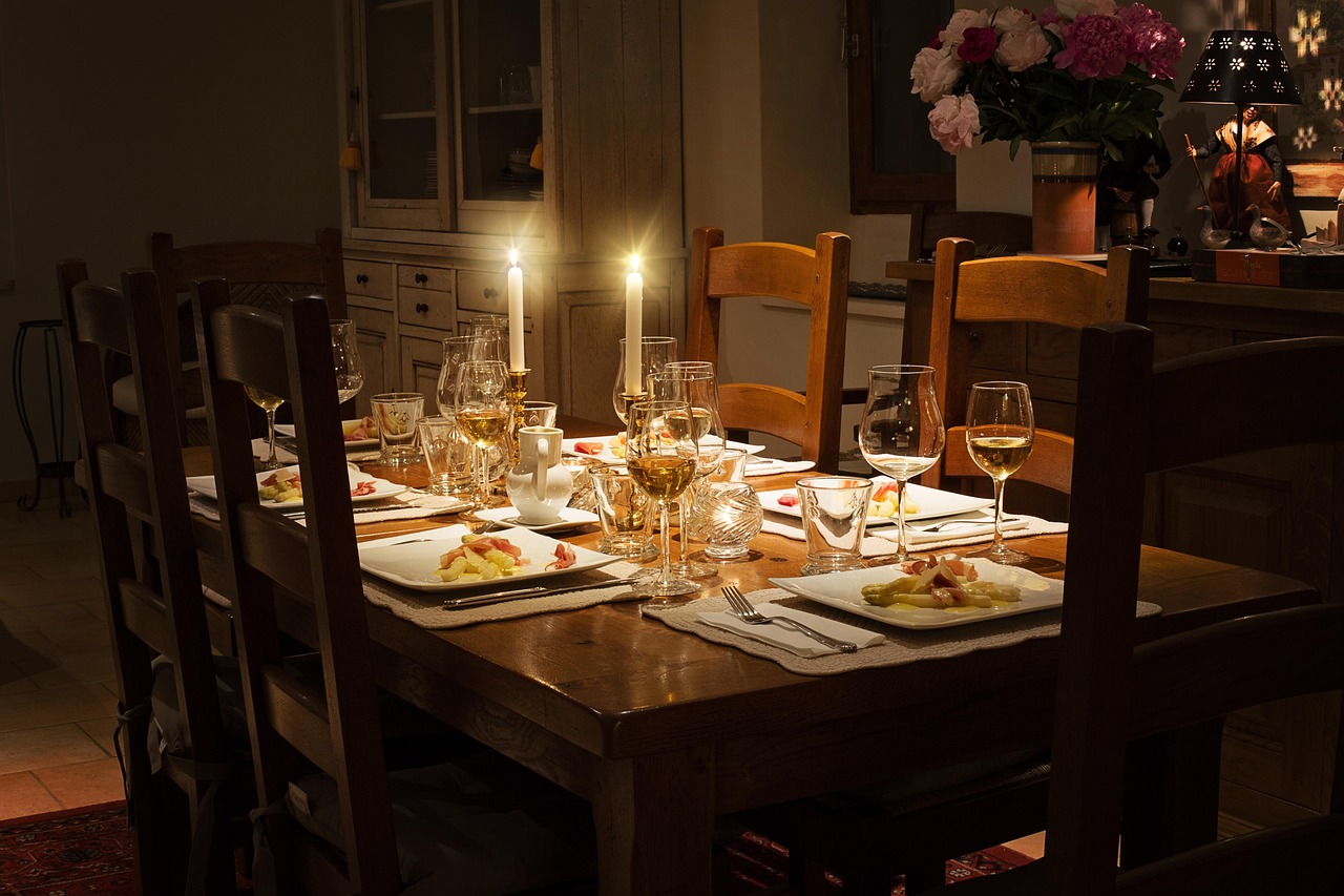
How to Sign Living Rooms & Lounges
How to use signage to help residents identify and feel comfortable in communal living spaces, supporting social engagement and reducing isolation.
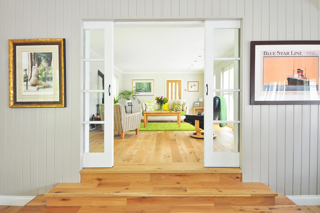
How to Sign Dining Rooms
How effective dining room signage supports mealtime routines, reduces missed meals, and helps residents living with dementia maintain nutritional independence.
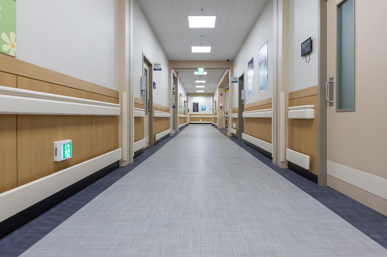
How to Sign Corridors & Hallways
A guide to corridor and hallway signage that creates effective wayfinding routes, reduces disorientation, and supports independent navigation for residents.
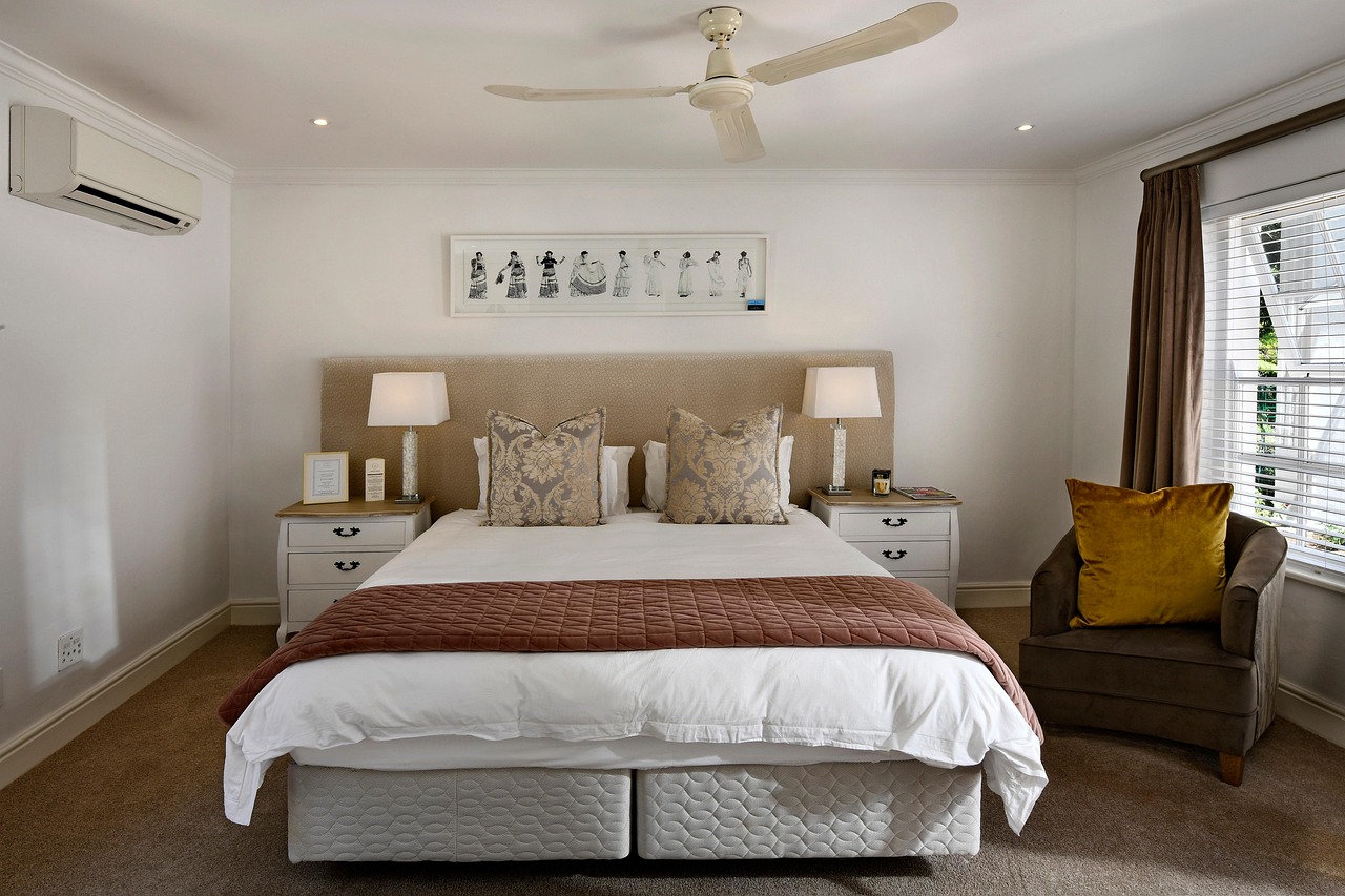
How to Sign Lift Lobbies & Stairwells
How to use signage in lift lobbies and stairwells to support safe vertical navigation, floor identification, and orientation for residents between levels.
Inspection & Regulatory Guides

How Signage Improves Your CQC Rating
Discover how dementia-friendly signage directly supports all five CQC inspection domains and helps your care home achieve an Outstanding rating in England.

Care Inspectorate Compliance: Signage Guide
How dementia-friendly signage helps Scottish care homes meet Care Inspectorate quality themes, with a focus on quality of environment and quality of care and support.

CIW Inspection: Signage Best Practice
A practical guide for care home managers in Wales on how dementia-friendly signage supports compliance with Care Inspectorate Wales (CIW) inspection standards.

RQIA Standards: Dementia Signage
Practical guidance for Northern Ireland care home managers on using dementia-friendly signage to meet RQIA minimum care standards and improve inspection outcomes.

HIQA Compliance: Signage for Nursing Homes
A comprehensive guide for Irish nursing home managers on using dementia-friendly signage to meet HIQA national standards and improve inspection outcomes.

CMS Survey Readiness: Signage for Nursing Homes
How dementia-friendly signage helps US nursing homes and assisted living facilities prepare for CMS surveys and meet federal requirements for environment, safety, and resident rights.
Sign Type Guides

When to Use Projecting Signs in Care Homes
Projecting signs mount perpendicular to the wall, making them visible from both directions along a corridor. Discover when and where they deliver the greatest wayfinding benefit in dementia care settings.

When Door Decals Make the Difference
Door decals are large, high-contrast vinyl graphics applied directly to the door surface. They are especially effective for toilet and bathroom identification, where speed of recognition can prevent incontinence incidents.

Door Signs vs Projecting Signs: Which is Right?
Door signs and projecting signs serve different purposes in a care home wayfinding system. This guide compares the two, explains when each excels, and shows how combining them creates the most effective navigation environment.

Personalised Signs: Making Care Feel Like Home
Personalised signs transform a clinical corridor into a familiar, homely environment. Paper insert signs, memory boxes, and personal photographs help residents with dementia recognise their own bedroom door and feel a sense of belonging.

Directional Signs: Wayfinding That Works
Directional signs with arrows guide residents through corridors and past decision points. Learn where to place them, how many you need, and how to create a coherent wayfinding system that supports independent navigation for people living with dementia.

The Complete Guide to Choosing the Right Sign Type
Door signs, projecting signs, door decals, directional signs, and personalised signs each serve a distinct purpose. This comprehensive guide explains all five types, provides a decision matrix, and helps you plan a complete signage strategy for your care home.
Best Practice & Design

The Complete Guide to Dementia-Friendly Signage
A comprehensive introduction to dementia-friendly signage: what makes a sign effective for people living with dementia, why DSDC 1A accreditation matters, and how to plan a complete signage system for your care home.
Understanding DSDC Accreditation: What 1A Means
DSDC 1A is the gold standard for dementia-friendly products. This article explains the accreditation process, what evaluators assess, and how specifying 1A-accredited signage benefits your care home during regulatory inspections.

Colour & Contrast in Dementia-Friendly Design
Dementia reduces contrast sensitivity, making it harder to distinguish between similar colours. This guide explains Light Reflectance Values (LRV), recommended contrast ratios, and how to choose sign colours that remain visible to residents with advancing dementia.

Braille & Tactile Signage: An Accessibility Guide
Braille and tactile elements make signage accessible to residents with visual impairment as well as dementia. This guide covers Braille standards, tactile imagery benefits, and how multi-sensory signs support a wider range of residents.
Evidence-Based Wayfinding for Dementia Care
Effective wayfinding in dementia care is grounded in research, not guesswork. This article reviews the evidence base for sign placement, environmental cues, and navigation systems that genuinely help residents find their way independently.

How Good Signage Reduces Falls in Care Homes
Falls are the leading cause of injury in care homes, and disorientation is a major contributing factor. This article examines how effective signage reduces falls by enabling confident, purposeful navigation and reducing the anxiety-driven rushing that leads to accidents.
Industry Insights

The Future of Dementia Care: Technology & Design
From sensor-integrated corridors to digital wayfinding displays, technology is reshaping dementia care environments. Yet physical signage remains the foundation of effective navigation for residents living with cognitive impairment.

Dementia-Friendly Communities: Beyond the Care Home
Dementia-friendly design should not stop at the care home door. Public spaces, high streets, hospitals, and GP surgeries all benefit from applying proven wayfinding and signage principles to support the growing number of people living with dementia in the community.

Training Staff on Signage & Wayfinding
Even the best dementia-friendly signage is only as effective as the staff who understand its purpose. Training care teams on signage placement, ongoing maintenance, and how to guide residents using environmental cues transforms signage from a passive feature into an active care tool.

Creating a Dementia-Friendly Environment: A Complete Checklist
This practical, room-by-room checklist helps care home managers, owners, and design teams audit their environment against dementia-friendly standards. Use it as a working document to identify gaps and prioritise improvements.

Transforming a Care Home with Signage: A Case Study
When Meadowbrook House, a 40-bed residential care home, invested in a comprehensive dementia-friendly signage scheme, the results exceeded expectations. Falls reduced by 28%, continence-related incidents dropped by 34%, and the home achieved a 'Good' CQC rating within 12 months.

The Science Behind Dementia-Friendly Design
Dementia-friendly design is not guesswork. It is grounded in decades of cognitive science research exploring how dementia affects spatial navigation, memory retrieval, and visual processing. Understanding the science explains why high-contrast icons, consistent placement, and familiar imagery are so effective.
Wayfinding & Navigation

The Ultimate Wayfinding Strategy for Care Homes
A comprehensive master guide to developing an effective wayfinding strategy that helps residents living with dementia navigate independently, covering signage systems, environmental design, colour coding, landmarks, and ongoing evaluation.
Designing Corridors That Guide: Wayfinding in Care Home Hallways
Corridors are the most challenging spaces for residents with dementia to navigate. This guide covers how to transform uniform hallways into intuitive wayfinding routes using signage, colour differentiation, landmarks, lighting, and environmental design.

Navigating Junctions & Decision Points in Care Homes
Junctions are where residents with dementia most frequently become lost. This guide explains how to design decision points that provide clear, unambiguous directional information through signage, landmarks, colour cues, and spatial design.

Colour-Coded Wayfinding Systems for Dementia Care
Colour coding is one of the most powerful wayfinding tools available to care homes. This guide explains how to design and implement a colour-coded navigation system that helps residents with dementia identify zones, floors, and destinations through consistent colour cues.

How to Conduct a Wayfinding Audit in Your Care Home
A wayfinding audit is the essential first step to improving navigation in your care home. This practical guide provides a step-by-step checklist for assessing signage, landmarks, lighting, colour contrast, and environmental cues throughout your facility.

Wayfinding in Multi-Storey Care Homes: Lifts, Stairs & Floor Identity
Multi-storey care homes present unique wayfinding challenges. This guide covers strategies for creating distinct floor identities, designing dementia-friendly lift lobbies and stairwells, and ensuring residents can navigate vertically as well as horizontally.
Resident Experience & Wellbeing
How Signage Promotes Independence in Dementia Care
Independence is one of the first casualties of poorly designed care environments. When residents cannot find the toilet, the dining room, or their own bedroom, they become dependent on staff for the most basic daily activities. Evidence-based signage restores that independence.

Preserving Dignity Through Environmental Design in Care Homes
Dignity is not just an abstract value -- it is experienced moment by moment in the daily lives of care home residents. When a person can find the toilet independently, recognise their own bedroom door, and navigate to the dining room without confusion, their dignity is preserved through design.
Reducing Resident Anxiety with Effective Signage
Anxiety is one of the most common and distressing experiences for people living with dementia in care settings. Much of this anxiety stems from environmental confusion -- not knowing where they are, where things are, or how to get there. Clear, consistent signage directly addresses these triggers.

Sundowning & Late Afternoon Confusion: Environmental Strategies
Sundowning -- the increase in confusion, agitation, and anxiety that many people with dementia experience in the late afternoon and evening -- is one of the most challenging aspects of care. Environmental design, including lighting and signage, offers practical strategies to reduce its impact.

Creating Personalised Spaces: The Impact on Resident Wellbeing
A care home bedroom is more than a room -- it is often the last private space a person with dementia calls their own. Personalising that space with familiar objects, photographs, and a sign that bears their name transforms an institutional door into the entrance to their home.

How a Well-Signed Environment Builds Family Confidence
Families choosing a care home for a loved one with dementia are looking for evidence of quality care. The physical environment -- and particularly the signage -- is one of the first and most visible indicators they assess. A well-signed home communicates competence, attention to detail, and genuine understanding of dementia.


